Manabú
ART DIRECTION
NAMING
BRANDING
VISUAL IDENTITY
ABOUT
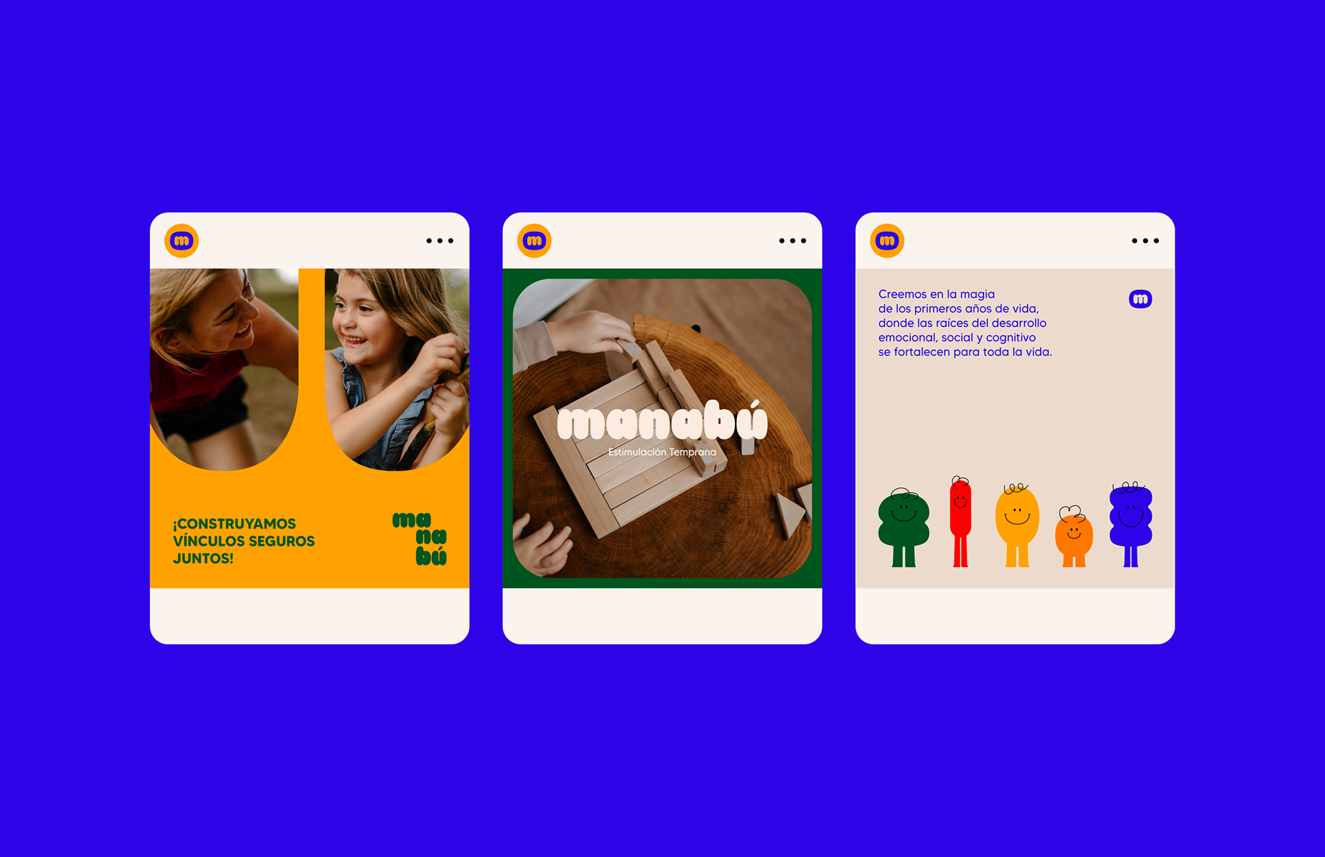
Manabú is a space dedicated to early childhood stimulation, rooted in the belief that the first years of life lay the foundation for emotional, social, and cognitive development—deep roots that nurture growth for a lifetime.
Central to Manabú’s philosophy is the idea that parents are a child’s first teachers and most important guides. The brand empowers families to create safe, loving environments where holistic development can truly flourish.
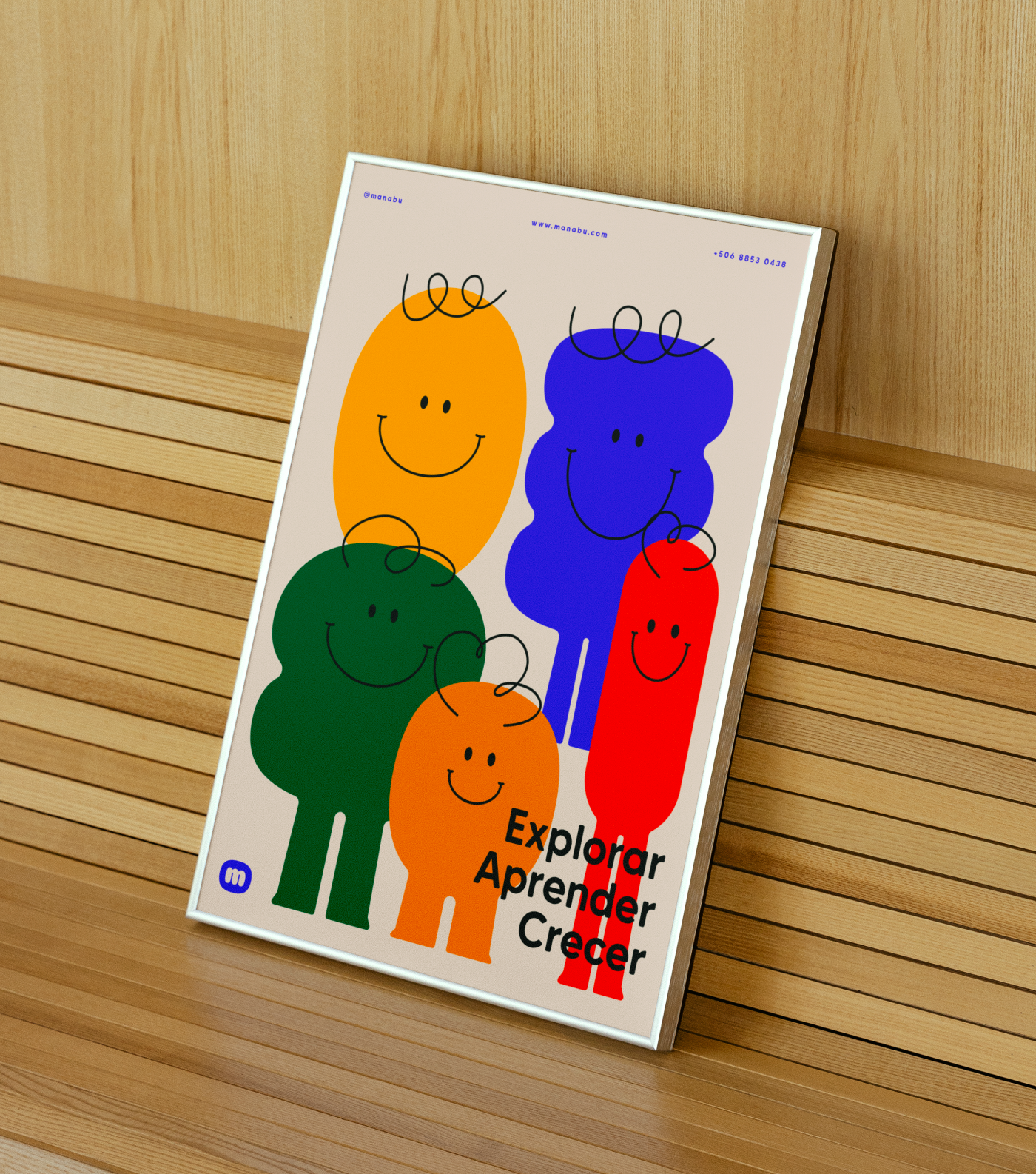
As part of the identity system, we designed a series of playful characters inspired by the logo. These figures were created to connect with young children, spark their imagination, and invite them to learn through joy and exploration.
The result is a brand experience that is warm, engaging, and full of curiosity—just like childhood itself.
IDENTITY
Through electric and vibrant tones, playful elements, and a playful yet intentional graphic system, the brand invites trust, joy, and connection.
CREDITS
Graphic Design, Naming & Art Direction: Rose DiMarte
Motion Graphics & Naming : Alo Murillo